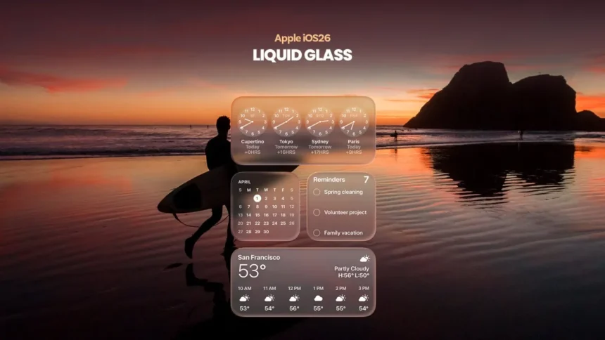
Apple continues to refine the visual architecture of its operating systems. The Liquid Glass interface, introduced in recent iOS releases, has become a prominent element of the company’s new design language. However, its excessive transparency created challenges in perceiving icons and system elements. As noted by NewsTrackerToday analysts, users often experienced visual blending of the interface with the background-especially when using dynamic themes and light wallpapers.
In the fourth public beta of iOS 26.1, the company introduced a new customization feature – the Liquid Glass transparency mode switch. It offers two options: “Clear” and “Tinted.” The first preserves the original glass-like effect, emphasizing visual purity, while the second adds a subtle dimming layer to improve contrast and readability.
According to Ethan Cole, NewsTrackerToday Chief Economic Analyst, “this refinement directly affects users’ perception of the devices and reduces frustration. Improving interface usability strengthens trust in the brand and supports customer retention – particularly among professionals who rely on Apple products in their work.” Experts at NewsTrackerToday believe that introducing user control over transparency is part of Apple’s long-term strategy to align the visual and functional experience across all platforms.
The toggle is available under Settings > Display & Brightness > Liquid Glass and is supported on devices running iOS 26.1, iPadOS 26.1, and macOS 26.1. Support for watchOS is expected to arrive with version 26.1. According to NewsTrackerToday, this unification of interface design across the ecosystem contributes to a more consistent user experience and reduces cognitive load when switching between devices.
For users sensitive to brightness or contrast, experts recommend enabling the “Tinted” mode. Those who prefer a minimalist look may favor the “Clear” option. Testing the feature is advised on secondary devices after installing the public beta of iOS 26.1.
In conclusion, News Tracker Today notes that Apple’s move reflects a broader shift toward a more flexible model of user interaction. The ability to fine-tune the visual layer enhances comfort, reinforces the perception of premium quality, and underscores Apple’s focus on interface details as a key tool for user retention.